Hillary Cianciosi
Frisco
Building a more modern, more scalable brand system
for Chewy's largest private label.

Frisco had grown into one of Chewy's largest and most recognizable owned brands, but its visual identity had become increasingly fragmented across packaging, ecommerce, photography, and marketing.
The challenge wasn't to reinvent Frisco.
It was to evolve it.
Our goal was to preserve the playful personality customers already loved while creating a more flexible brand system capable of supporting hundreds of products across dozens of categories.

My role
Creative Direction
Brand Identity Development
Visual Systems
Packaging Direction
Photography Direction
Cross-functional Leadership
Led a multidisciplinary team
responsible for evolving Frisco's
brand expression across touchpoints.
Big joy,
Little moments.
The strongest part of the existing brand wasn't the logo.
It was the relationship between people and their pets.
Every design decision became a way to spotlight those moments.
The refreshed identity simplified and clarified the visual language,
creating a foundation capable of supporting future growth.

It takes a village
This project required alignment across designers, copywriters,
photographers, marketers, and brand stakeholders.
My role was to ensure every creative decision strengthened the
system while maintaining the personality customers already recognized.
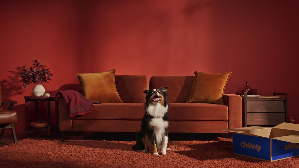
Photography
Photography became one of the most powerful tools
for expressing the brand's personality.
We evolved the visual direction to focus on authentic moments between pets and their people—capturing the curiosity, comfort, and occasional chaos that make those relationships meaningful.
Every image was designed to feel approachable, joyful, and lived-in, reinforcing the emotional connection at the heart of the brand.
This photographic language became a foundational component
of the broader Frisco identity system.


Packaging
Packaging was the most visible expression of
the refreshed Frisco identity.
We developed a system that brought greater consistency, clarity, and shelf presence across a wide range of product categories while preserving the brand’s approachable,
playful spirit. Every element—from hierarchy and color
to photography and messaging—was designed to help customers quickly understand the product while
strengthening recognition of the Frisco brand.
The result was a more cohesive packaging
ecosystem built to scale.
Ecommerce
Frisco's digital presence needed to work just as hard as its packaging.
The updated visual system was designed to create consistency across product detail pages, campaign assets, navigation, and merchandising experiences.
By establishing a more cohesive approach to typography, photography, color, and hierarchy, we created a shopping experience that felt unmistakably Frisco while helping customers navigate a rapidly expanding product assortment.
The result was a more scalable ecommerce ecosystem that strengthened brand recognition at every customer touchpoint.


A successful brand system must perform beyond packaging.
The refreshed identity was built to flex across campaigns, seasonal initiatives, social content, email, and promotional experiences without losing cohesion.
By establishing clear visual principles and adaptable creative frameworks, we created a system capable of supporting a wide range of business objectives while maintaining a consistent brand presence.
This flexibility allowed teams to move quickly while ensuring every customer interaction reinforced the Frisco story.